Foreign exchange price charts are graphs showing the continually changing exchange rates between two currencies. When you buy one currency, you are also simultaneous selling the other currency in that pair against it. For example, if you are buying euros in the euro currency pair (EURUSD), you are also selling U.S. dollars and vice versa.
The trading data of currency pairs consist of two data points: the buy price and the sell price. These are the prices that the broker is willing to buy and sell the currency.
The buy price of a currency is always higher than the sell price. Consequently, when a trader buys a currency, the price action needs to move above the sell price before the currency can be sold at a profit. Similarly, when a trader sells a currency, the price action needs to move below the buy price of that currency before it can be bought back to make a profit. (The process of buying and selling currencies is covered in an earlier blog.)
Since the buy price is always higher than the sell price of a currency, the broker is always compensated for his service regardless of whether you win or lose money on a trade. The broker always wins!
The difference between the buy price and the sell price is called the ‘spread’. Traders are advised to avoid trading currency pairs with a large spread, since exaggerated price movements are required before profits can be taken.
Data on foreign exchange price chart can be displayed in various ways. Such graphs are price levels plotted against time. The charting software allows for different timeframes to be viewed. Common timeframes include: Monthly, Weekly, Daily, 4-Hourly, 1-Hourly, 30-Minute, 15-Minute, 5-Minute and 1-Minute.
Sometimes a tick chart is also provided to show the actual data points. Such charts can be very useful since, in rapidly moving markets, price levels can sometimes gap past the buy or sell levels designated by the trader, causing slippage in the opening price of the trade.
Currency pair data on foreign exchange price charts are displayed as: the buy price, the sell price, or the mid-point between the two. Charting software normally allows traders to select which graph to view. A graph of the currency mid-point is most commonly used. However, traders still need to beware of the potential effects of the spread.
The graphs on foreign exchange price charts can be displayed in various ways. They include: line charts, bar charts and candlestick charts.
A line chart is a graph of the closing price for the designated timeframe increments plotted over a period of time. The price points are joined together with straight lines.
Bar charts and candlestick charts display more information. For each timeframe increment, both types of charts display: opening price, highest price, lowest price and closing price.
Such bar charts are also referred to as open-high-low-close charts, or OHLC charts, to avoid confusion with histogram charts (which are also sometimes referred to as bar charts).
The following diagrams illustrate how such information is displayed:
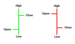
Each increment on a bar chart or candlestick chart tells a story from within that timeframe. The OHLC bar or candlestick opens at a certain price level; it rises to a maximum high level and falls to a minimum low level, or vice versa; and it closes at a certain price level.
To gain a more detailed understanding of this activity requires opening a chart at a lower timeframe. Forex students are encouraged to visualise how lower timeframes would appear on higher timeframes and how charts of differing timeframes relate to each other.
The direction of an OHLC bar is clearly determined. However, candlestick direction is dependent upon colour. An uptrending (bull) candlestick is either hollow or typically green. A downtrending (bear) candlestick is either filled or typically red.
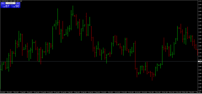
Example of an OHLC bar chart:
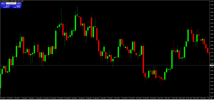
Example of a candlestick chart:
Candlestick charts are more commonly used.
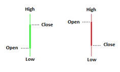
The anatomy of a candlestick consists of the upper shadow, body and lower shadow. The body exists between the open and close; the upper shadow is between the high and the close (bull candle), or between the high and the open (bear candle); the lower shadow is between the low and the open (bull candle) or between the low and the close (bear candle).
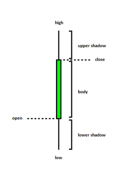
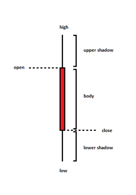
Being candlesticks, the shadows are also referred to as wicks.
As stated earlier, each candlestick tells a story within that timeframe increment. In addition, the shape of the candle also gives an indication of the trading sentiment of the currency within that time period. Such candlestick shapes and also groups of candlestick patterns provide the experienced trader with signals for buying and selling trades and when to take profits.